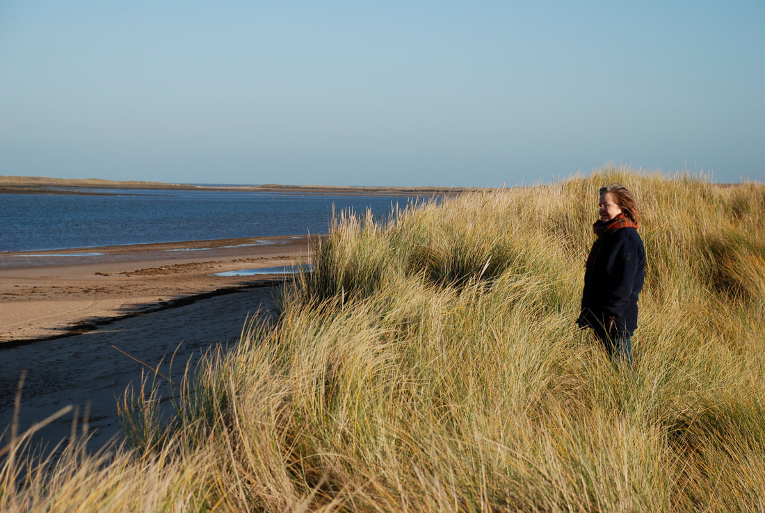
 Lovely Sarah Coghill - photo provided by her daughter, Catherine Mun-Gavin 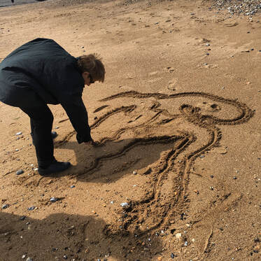 My mum drawing in the sand Last Sunday it was Mother's Day in America which is where my mum lives so though I live in another country, I wanted to share with everyone how much of an influence she is in my life, especially as she was one of the reasons I also became an artist. I really wish I lived closer so we could see each other more often. My family is split across two countries and it's quite challenging and lonely to be so far apart from those I love. So I offer this blog post as a virtual hug to my mum for what I'm calling Happy Mother's Week! When I was growing up, I had two very inspiring creative women in my early explorations in the arts and those two women were my wonderful mother, Juliette McCullough and her dear friend, Sarah Coghill, both figurative oil painters. I was accustomed to being the subject of many of my mothers paintings and drawings and watching her mix colours and paint in her studio. I remember sitting and listening in fascination to the conversations between my mother and her friend Sarah when we would visit and it was in those early years that I knew I would also be an artist. From being a silent witness in both my mother's studio and Sarah's studio, I came to understand the set up of the palette and techniques and peculiarities of each artist. I grew up loving the rich aroma of linseed oil and the course scratchiness of palette knives across treated glass palettes. I learned to stretch a canvas by the age of two, was encouraged to discuss my opinions on art in a curatorial setting in exhibitions and studios and had thumbed through epic art book collections by the age of ten. No art school could do what my mother and Sarah did for me and I'm so aware how precious this upbringing was. My mother's paintings are gritty and full of the deep souls of our human existence - they thrum with their own heartbeat and I regard many of her works that she did during my childhood as equal as family members. They are well loved and intense and part of the fabric of the imagery that shaped me. Now her paintings are full of sinews and living textures that make her work come to life under the veil of paint. There are not words to accurately describe what I want to say about my mother's paintings, except that they are paintings that need to be shared because their message is something we need to have in our eyes because it shows us our own humanity which is so important. Sarah's paintings were like memories captured in a single moment, imbued with a colour intensity that poured into me as a synesthete and in colour spoke a language unwritten in words that for me was lyrical and poetic and full of the wind and sun and smell of the grass. Sarah seemed to channel the earth we stood on when she painted, it was rich and intense and echoed with family and friendships like a woven tapestry. I miss her dearly. My mother sculpts with oil paint. She is able to dig deep and pull to the surface of the painting, beings that we encounter in our subconscious to which my mother has somehow found the key to all that roots us to who we are in this existence and it awes me daily. She fuels my own artistic journey, especially in my own teaching because of course when I was young, my mother was my teacher. I did go to art school but it was my mother who taught me colour theory and how to actually "see" colour. It is now her teaching methods that I employ in my own teaching to my students. There is something really magical about learning to actually "see" and understand how to draw and paint that makes every blank paper or canvas a treat. So as far as mothers go, I have been incredibly fortunate! I'm genuinely grateful of the regular conversations I have with my mother, Juliette, on all things art related which keeps me firmly footed on this earth as the artist I am because of the journey she set me on over forty years ago. So Happy Mother's Week to my mum, Juliette and to Sarah too - the biggest impacts in my life as an artist.  One of Sarah's paintings - provided by her daughter, Catherine Mun-Gavin I feel like I'm a participant in her painting.....it's like I'm buffeted by the wind, and can feel the sun and smell the air. It's glorious and I want to inhale deep to capture it all! 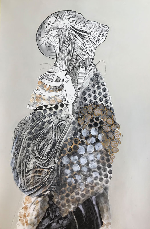 "Anatomy 3" by Juliette McCullough - Collage. Follow my mum on instagram: @Juliette_McCullough
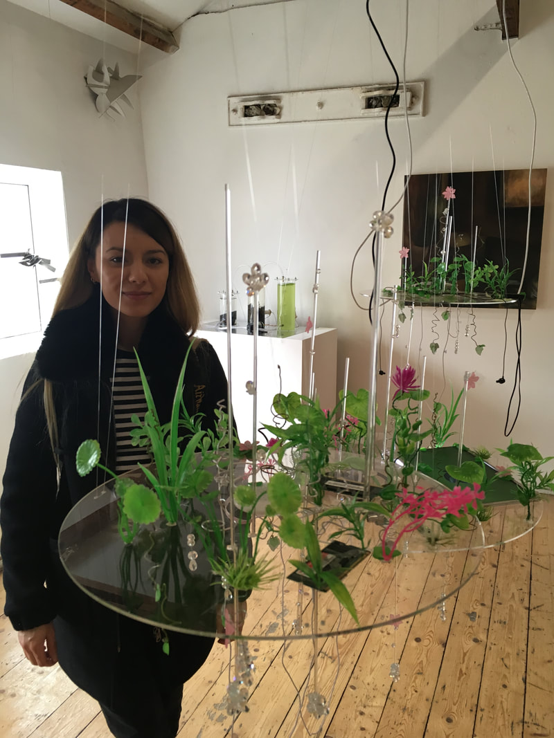
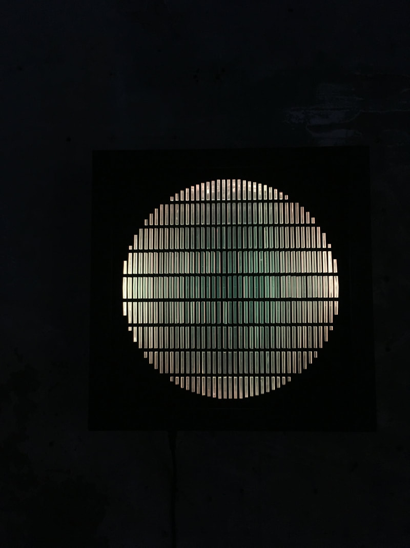
I just find this one so delicious in textures and colours and so alive! It's as if I can "feel" it's intensity in my own body. To visit my mother's website please go to: www.juliettemccullough.com This week I'm giving myself a rest so instead of giving a review of an exhibition I've seen here in London, I'm opening up my own creative space to you to share with you where I work, what I have on display, what I'm working on and chances to come and tour my workspace for yourself. I work in my tiny bedroom which is limiting for obvious reasons. The majority of my art materials live in various sealed containers under my bed which is a sort of slapped together storage unit made from two mattress boxes - my flatmate helped me put them together so I could cut out the front fabric, elevate my bed and have massive storage spaces for all the materials I need. It works but it's challenging too. My room is the width of the length of my bed, if that makes any sense. I also have a wardrobe, desk, chair, 3 bookshelves and a bedside table. It's like living in a walnut! Because of the cramped space, any sculptures that I do have live on the ceiling, with the biggest sculpture languishing on top of one of the bookcases. I try to keep organised but it does get quite overwhelming sometimes. The majority of my finished paintings/drawings end up either on the walls or leaning up against the walls where ever space can be found. I often fantasise about having a bigger studio space again but that would only work if I was actually successful in my ongoing job search and could afford to move somewhere with more space.....still trying. At night, all my sculptures and some of my miniatures glow which is quite enjoyable. I'd happily show off my little creative workspace with anyone interested so please get in touch if you are in London and would like to see what it's like for artists like myself who have to work in tiny spaces. My email is: toothpickmoon@gmail.com 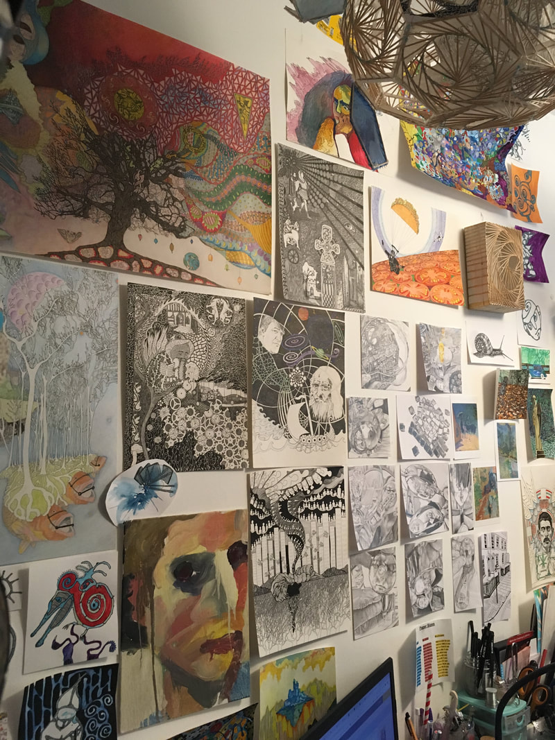 Above is the main wall of work where I put old and new 2D work, partly to give myself inspiration and also to get it out of the way. 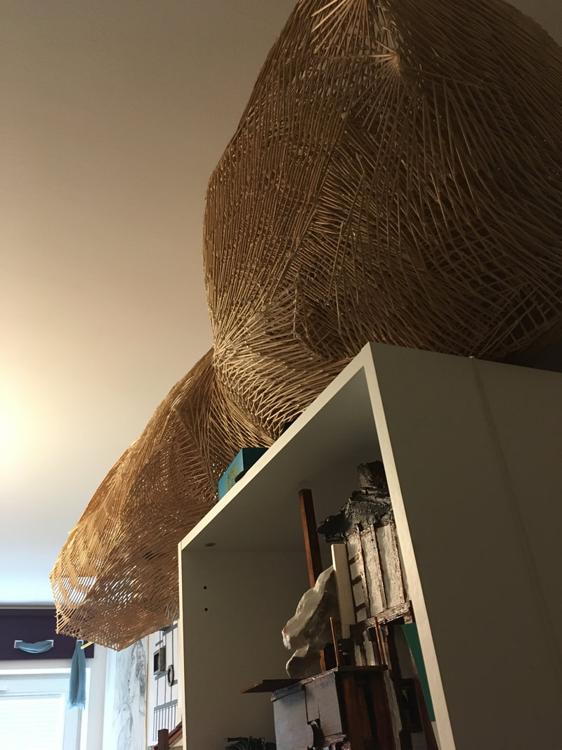 Fibonacci Fold Pod - one of the largest sculptures I have here in London that takes up space on top of a bookshelf. 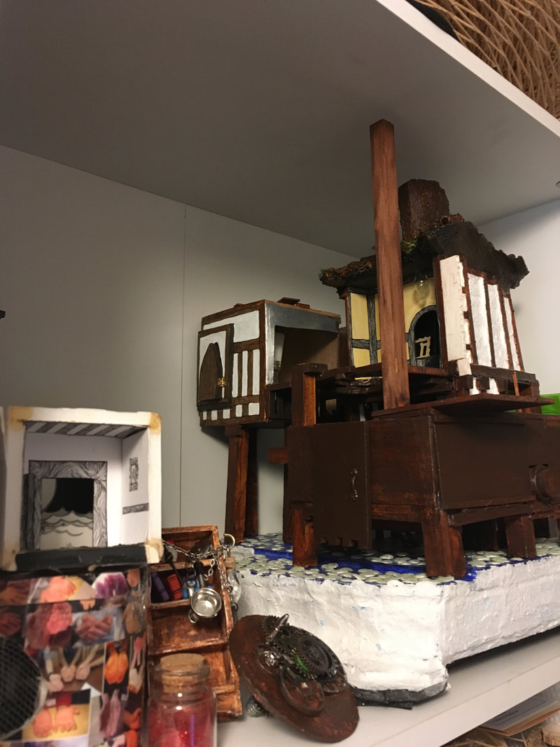 Above, miniatures in various stages of progress on the top shelf of a bookcase. 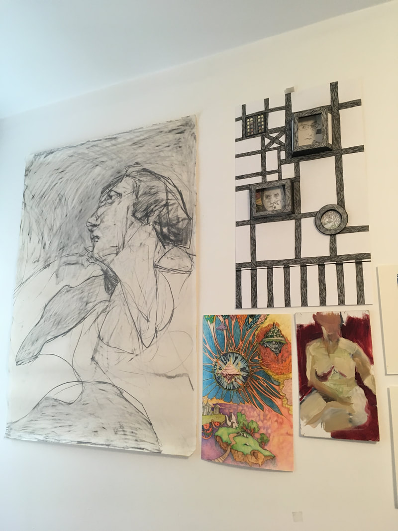 Above - at the foot of my bed, one of my mother, Juliette McCullough's drawings and a scattering of my own work, old and new. 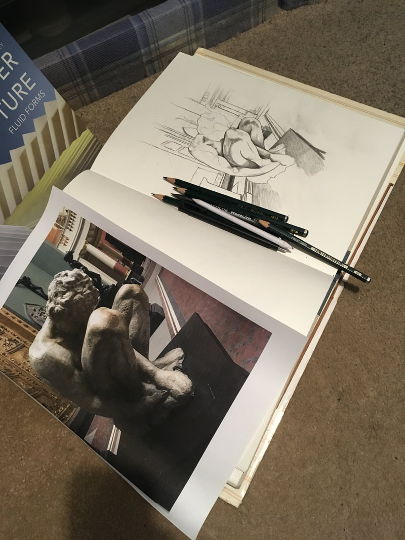 Sketchbooks on the floor, the only place other than the bed where I can put projects half in progress. 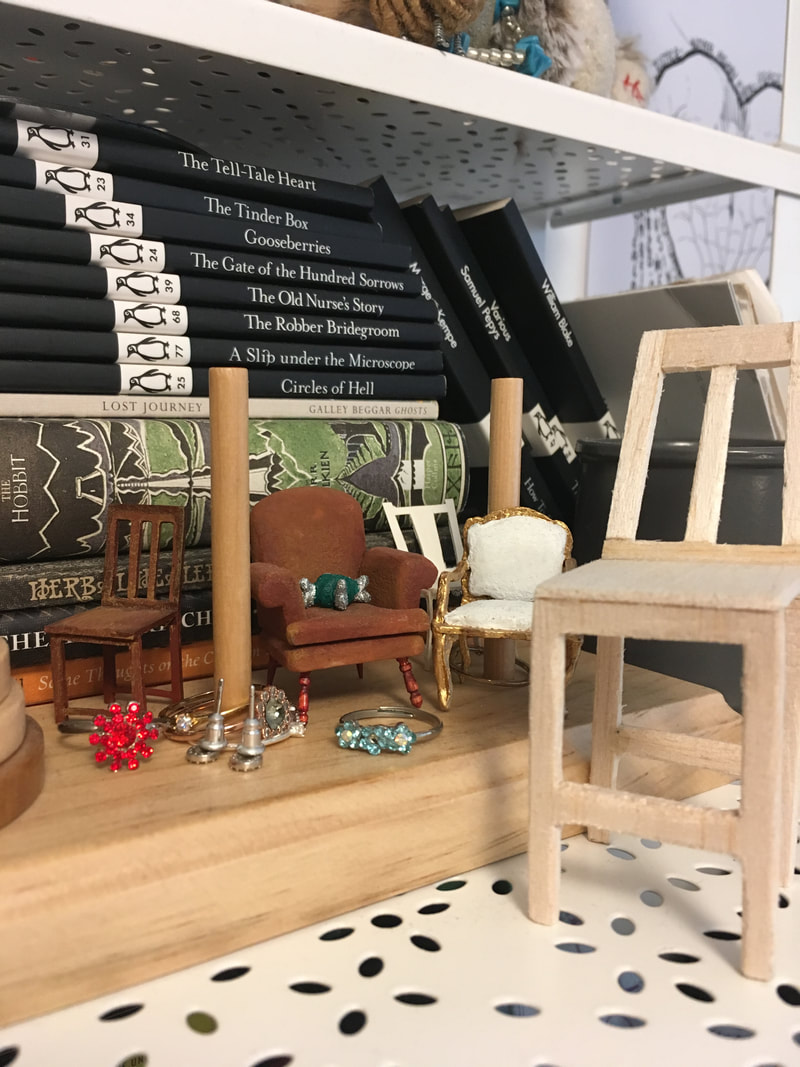 Above - miniature chairs mixed in with toys, books and jewelry that is part of my bedside shelf/table! 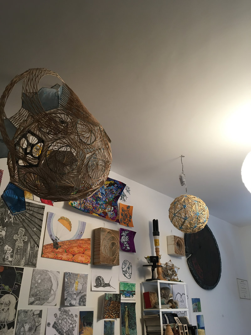 Above, a few ceiling sculptures, drawings/paintings and a viking shield prop that's at the head of my bed. 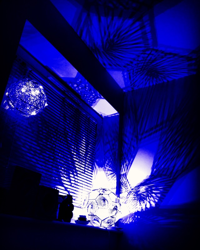 Above - at night all my sculptures and some miniatures will glow.
Today I went to see the Emma Kunz exhibition at the Serpentine Gallery as I'm fascinated by artists working in geometry. This artist was unusual and difficult to find out about prior to visiting as she never exhibited her work during her lifetime and is for the first time being exhibited in the UK. She is completely unknown and yet quite fascinating. Apparently she was a healer and had telepathic tendencies and the ability to heal others using her craft. It seems that her pendulum drawings were tools in her trade. She didn't title them and seems to have only used them as a way of learning how to treat the various people she encountered who came to her looking for treatments for their different ailments. I find it fascinating that the benches in the galleries are made from a stone that is from Switzerland and imbued with healing qualities which were sculpted by artist, Christodoulos Panayioutou. The idea here is to sit on these benches and meditate on Emma's work and perhaps glean some form of healing for yourself in the process. I sat on one of these benches and got cold and had to put my coat back on. I'm not entirely sure how I feel about the work but I do like the peaceful feeling in the galleries as her work has a very calming quality so perhaps something is at work here. I'm sure the people that benefit the most are the lucky gallery attendants who work there who are all so sweet and lovely to talk to. Highly recommend a visit to the exhibition as its so nice coming to the Serpentine anyway, especially on a lovely spring day and also because Emma Kunz's work is very intriguing and if you allow yourself a good hour to go around quietly and just to sit and meditate then it's a very liberating experience. See below my images from the exhibition: 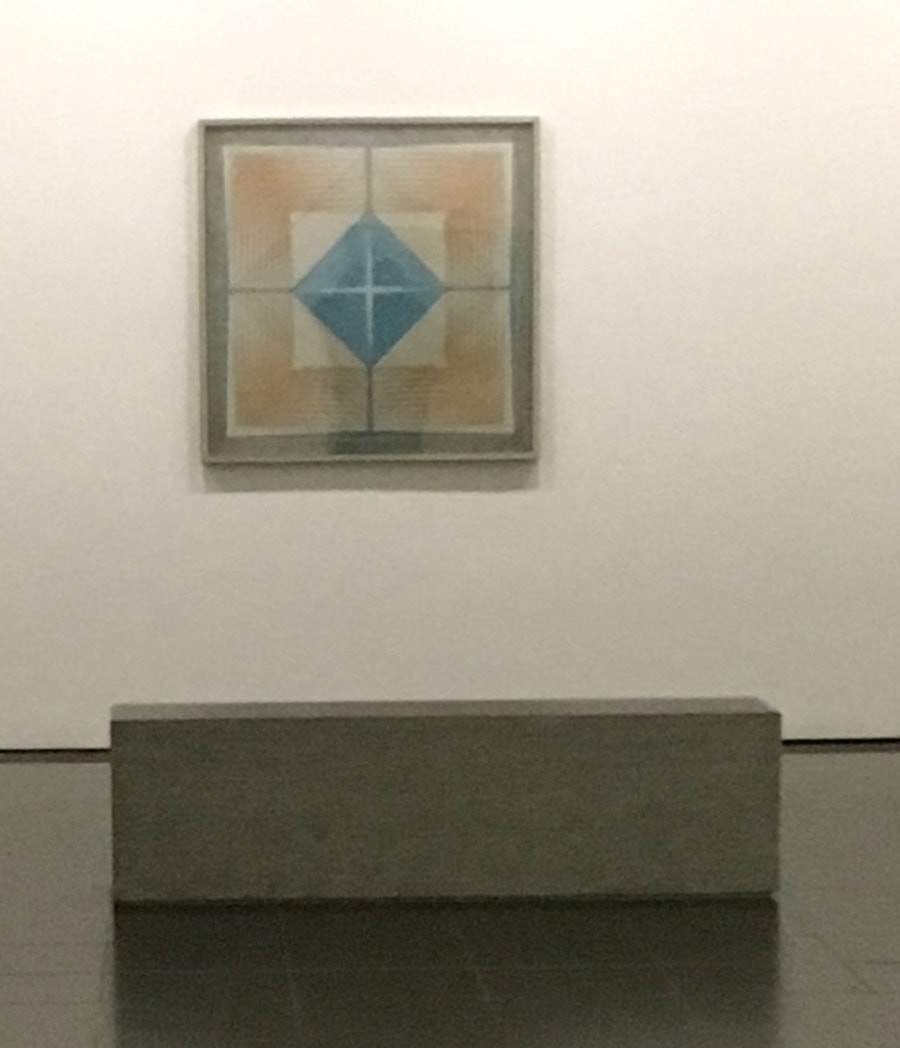 This is one of the benches you can sit on to meditate at the work. A bit chilly but quite a nice place to sit and contemplate. 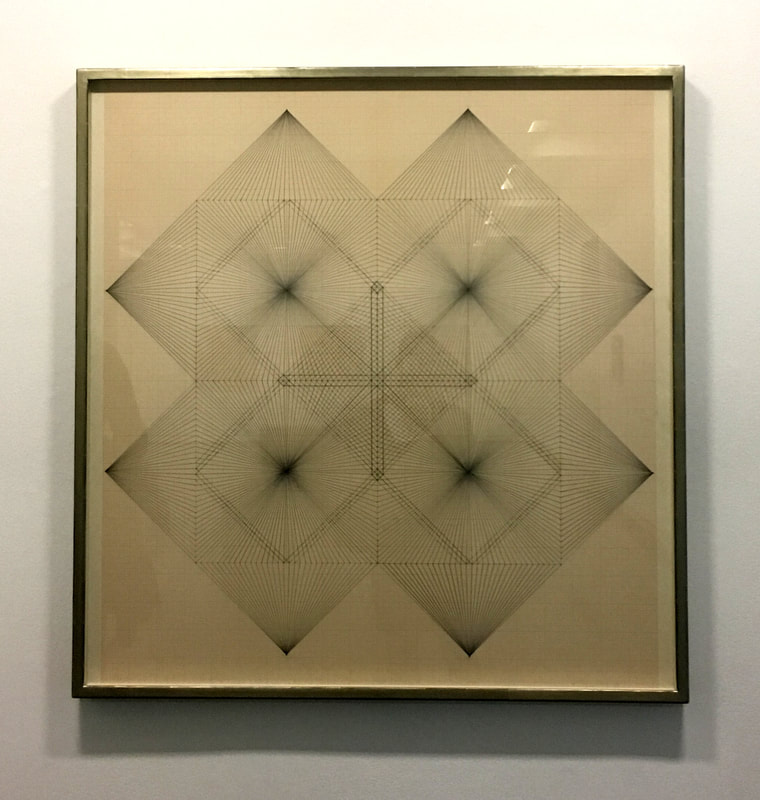 I loved this image..... 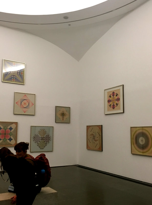 This is the biggest room with lots of Emma's work all over the walls and a wonderful light coming through from above. A great place to meditate if you're lucky enough to have the room to yourself.
-All highlighted red underlined words are links leading to related content. *If you enjoyed this exhibition review then stay tuned every Thursday at 9am UK time for more!   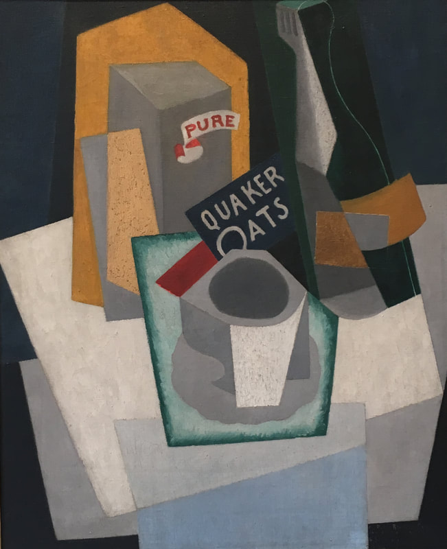 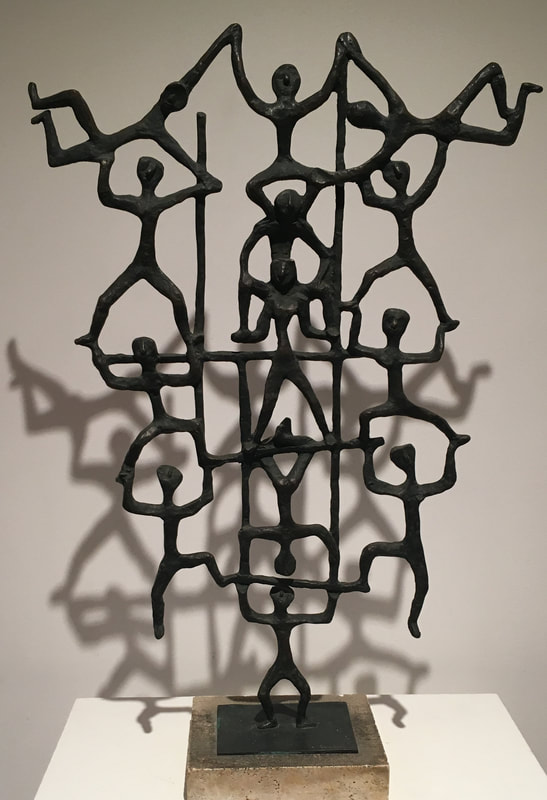 Yesterday I visited the Estorick Collection of Modern Italian Art in Islington, North London. A new friend from my very active London Art Museum Creatives meetup group suggested it to me and I've been eager to see what it's all about.
Being a Contemporary British Sculptor myself, I'm intrigued by other artists work especially artwork well known in other countries. I find it's really nice to have a different perspective and as I really love most things Italian, it was a fun visit. Firstly, it's a very short walk from Highbury & Islington train station with the walk meandering through the nice residential neighbourhood of Canonbury. The building that the gallery is in is very nice and recently had some renovations. It's quite nice inside and has the temporary exhibition on the ground floor and the more permanent collection on the floors above. There's also a nice little shop and cafe and garden too as well as a library. I went on a very rainy cold day so I'm sure it's much nicer outside in their garden on sunny warm days! The history of the building was very interesting too. Apparently the gallery takes its name from that of Eric Estorick who was an American writer and sociologist who was gathering an art collection after the Second World War while living here in England. Turns out he and his wife were regular visitors to Italy and were very lucky to meet and befriend many popular artists during this time. You can see by his collection that he was very inspired by Futurist paintings coming out of modern Italian art just after the war as he has many great masterpieces from artists of that time period. The gallery has other works too that are unrelated to Futurism and they're just as fascinating and quite a lovely hidden gem in this very crowded city! I can't tell you how glorious it was to be alone in these galleries and to have the artwork all to myself without millions of tourists all around like in the major art museums not too far away. Cost to get in is minimal which is great. I paid just £7.50 to get into both the permanent collection as well as the temporary exhibit so that was a bonus! So the Fausto Melotti Counterpoint exhibition has only recently begun on the 16th of January and will run until the 7th of April 2019 so do try to see it if you can. Apparently according to what I read in the gallery, this artist is very well known in Italy but hardly noted here in the U.K. which is a shame as his work is rather interesting. The first moment I entered the room, I was intrigued by his interests in the languages of music and mathematics and his visual interpretation of these combinations. Of course, art and science fascinates me so to see how another artist weaves their own visual perspective using their own explorations in the sciences is very interesting indeed. There were a few works that I didn't completely understand and it would have been great to have an explanation nearby. There were a few other pieces that I did wonder about mostly because they peaked my imagination in either the title or the material used. Please refer to the images above to make your own speculations of his work. An interesting exhibition but lacking in explanations to those of us who don't know the artist very well and his visual interpretations. Though if I want to learn more, all I have to do is google this artist but not many people will research further so I'd say it's a pity the gallery didn't offer a little bit more for those of us unfamiliar with each piece and what it means or represents. I'd love to have had more details in the labels so I could have understood more. Interesting exhibition otherwise. Some examples of this at the top of the page: top two images are by Fausto Melotti, bottom two images are by Gino Severini (Quaker Oats - Cubist Still Life) and Giuditta Scalini (Acrobats). If you'd like to visit the gallery for yourself please follow the links below: Twitter: @Estorick Facebook: facebook.com/estorickcollection Instagram: instagram.com/estorickcollection Pinterest: pinterest.com/estorick www.estorickcollection.com email: curator@estorickcollection.com *If you enjoy reading about different exhibitions I've been to and would like to see more like this then please stay tuned every Thursday at 9am UK time. A few days ago, I went to see the Dorothea Tanning Exhibition at the Tate Modern here in London, not really knowing much about her but having been bombarded by advertisements everywhere to go and see this! The actual image they have been using on the posters and website for this exhibition didn't excite me at all as that sort of painting never does......it seemed very steile and not what I enjoy as a painter. Because I wanted to attend this event with unpredictable dialogue, I arranged this outing to be an event in the meetup group that I currently run and quite a few people turned out which was exciting. (I will put in a note here, that I tend to have my friendliness misunderstood to be flirting by various men I encounter, who, perhaps use meetup in a different way than I do) That said, we can move on.... First of all, thank goodness it wasn't expensive which is a relief as the Tate Modern tend to charge more than necessary very often, probably due to the mass quantities of tourists in the city. Well, being on benefits, it's a bit of a challenge to maintain a life as an artist as I often can't afford to attend certain exhibitions due to the ridiculous high ticket prices! Luckily I spent very little.....an affordable £10 (only affordable due to using my credit card!). So the exhibition itself tracks the seventy year career of Dorothea Tanning - 1910 to 2012. It says in the brochure that her work asks us to look beyond the obvious. Her earlier surrealist paintings have a lot of narrative that's not obvious or known to the viewer and does peak the curiosity to understand what is happening....with labels not often offering this information. Her use of symbolism is intriguing to say the least and definitely taps into a connection to the subconscious which ensures to generate dialogue which is why I wanted to attend this exhibition with others. So Dorothea Tanning was an American painter and I didn't even know about her which is strange as I don't think she was even in my art history courses when I was a young art student at the Kansas City Art Institute way back in the 1990's! I remember her husband, Max Ernst very well as I loved his paintings but I never heard mention of Dorothea. I love that she wanted to create her own spaces in her work.....I can sort of relate to that mindset as I do this a lot in my own practice. It doesn't matter what my living situation, once immersed into drawing, painting or sculpting, I'm in a world that is entirely the meaning of "home" to me. So in the exhibition, first few paintings.....not very exciting as expected as they were tight and not fluid but the second room got fun! The first one that got my attention was of a door that divided a canvas in two with two figures on either side of the door (entitled, "Door 84").....it's fluid and there's so much movement in this piece. So apparently the door is a surrealist symbol: a portal to the unconscious (according to the brochure).  "Door 84" - above was where I started to consider liking this painter so this was a good start! The only strange thing about where they put this painting was that it was in a room full of paintings that the artist had painted decades before.....this Door 84 being painted in 1984. It's like the people who curated the exhibition couldn't decide where to put the paintings.....in order of when they were painted or in relationship to each other.......it was a little discombobulating. If I had an exhibition of everything I'd created from my whole life then I'd find it really odd if some of my later more recent work was mixed in with very early work. As an artist myself, I feel that artwork has a narrative all of its own and that progression from start to finish is important in the development and understanding of the artist.....so yeah a bit weird, their curation of the show. 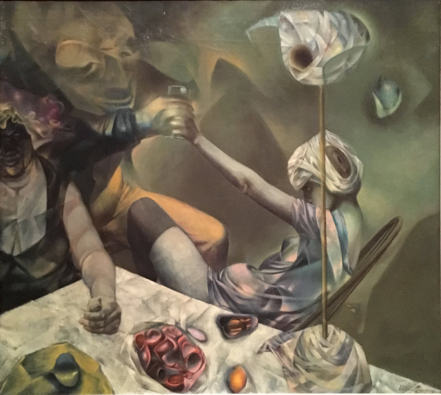 "The Philosophers" painted in 1952 was in the same room as "Door 84".....(room 2 and 3 are joined so you tell me how that reads to you in the progression of the artists development!) Anyway, I lingered a while here at this painting, not because of the variety of activity in this piece but because of the way she painted the folded tablecloth which intrigued me as she made it so tactile.....I felt like I could feel it on my skin as that slippery silky folded cloth that I know it to be. The memories of those creases in that fabric that won't lie flat and held its own symbolism in the act of staying folded. This is something I'd like to revisit so I think I'll have to return to see this painting in person again to ruminate on this and see what develops. 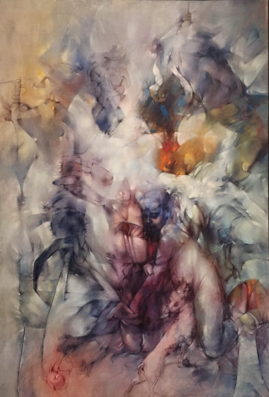 "Insomnies (Insomnias)" painted in 1957 presumably when Dorothea and her husband Max had then moved to live in France.....she's painting that damned folded tablecloth again and before I read the description, I knew it already and from this was able to understand the previous painting. In this painting here it says in the label, "Tanning intended our experience of this painting to unfold gradually. In it, the figure of a child - identifiable by a face at the centre - is depicted as disjointed body parts which seem to disappear and reappear amongst folds of cloth. Tanning explained her process: It was like a game, hiding and revealing my familiar images, floating them in mist or storms. I felt like a magician, just to bring these forms out of nothing with my brush and paint." At the end of the label it states: "The title of the work suggests the anxiety of night-time wakefulness." which I think hits home for everyone! Needless to say, it fascinates me.....and confounds me because of the memory of those folds yet again so I think another visit to this exhibition is in order. 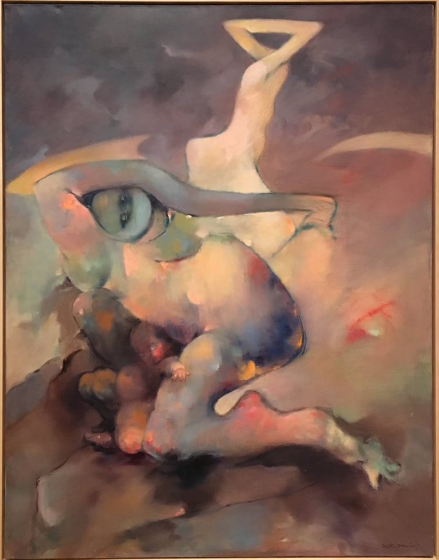 "Heartless" painted in 1980.....a painting in nearly the last room.....I've left a great deal out but it would ruin it if you were intending to visit for yourself.
This painting was difficult to walk away from as there was too much that my brain wanted to try to unravel. Too many hidden meanings and unsaid words. I like what Dorothea says, "I don't see why one shouldn't be absolutely fascinated with the human form....we go through life in this wonderful envelope. Why not acknowledge that and try to say something about it? So what I try to say about it is transformation." I'm still thinking about the exhibition as it has made an impact on me as a figurative painter and I am wondering how it will impact my own practice. I think if you're here in London or nearby then you need to go to see this exhibition as it'll get you thinking.....which is good in this day and age of technology! ---------- - Per usual, all red highlighted underlined words are links to related content. *If you enjoyed reading through this exhibition review and would like to see more then please stay tuned to this space every Thursday at 9am UK time for more! Last weekend, I attended an exhibition with friends at the Camden Image Gallery which turned out to be a fascinating and inspiring visit as I got to meet several of the artists which I found really interesting as well as friends of the artists too. The work is gorgeous and literally a treat for the eyes especially to those of us who love to paint! The painters are united by colour and light and had me returning in thought to my recent visit to the Pierre Bonnard exhibition at the Tate Modern and his explorations into colour and light. The exhibition at the Camden Image Gallery ran from the 13th of March to the 18th of March and featured the work of five artists: Karin Friedli, Ayse McGowan, Dawn Limbert, Neeta Popat Kataria and Diana Sandetskaya. I'm including below a sample of these artists work or at least my favourites of their work from this recent exhibition. I do love how they all have captured nature in such a way to suggest paths not yet discovered or glimpses into a future world not yet explored. It sparked my imagination for sure so I was excited to share what I saw. The red highlighted names above lead directly to their individual websites. Please see below their wonderful paintings and check out each artist and their links to follow what they're up to. Links to all artists and this particular gallery are below the images. 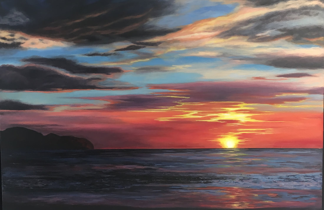 "Pacific Sunset" by Diana Sandetskaya www.dianasandetskaya.com www.artfinder.com/diana-sandetskaya diana.sandetskaya@yahoo.co.uk 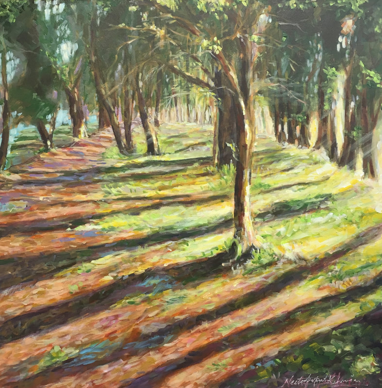 "Evening Shadows" by Neeta Popat Kataria www.neetakpopatkataria.com @nkat27 neetakpopatkataria@gmail.com 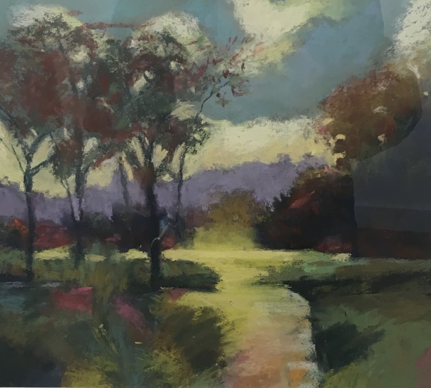 "Follow the Path" by Dawn Limbert www.dawnlimbert.com Instagram: @dawnlimbert Facebook: Dawn Limbert Art dawnlimbert@btinternet.com  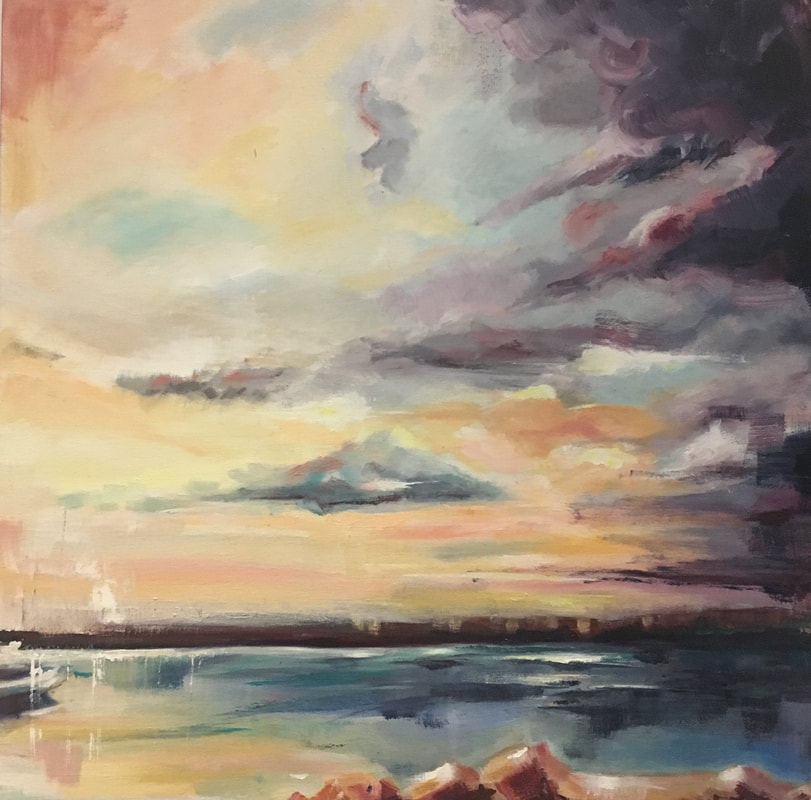 "North Cyprus Sunset" by Ayse McGowan
www.aysemcgowan.com ayse.mcgowan@gmail.com Instagram/aysemcgowan_art --------------- To learn more about exhibitions offered by the Camden Image Gallery please go to their website at: www.camden-image-gallery.co.uk If interested in purchasing artwork from these particular artists, then please see below each of their paintings for their contact information. *If you are enjoying these exhibition reviews then stay tuned every Thursday at 9am (UK time) for more from the London art scene.
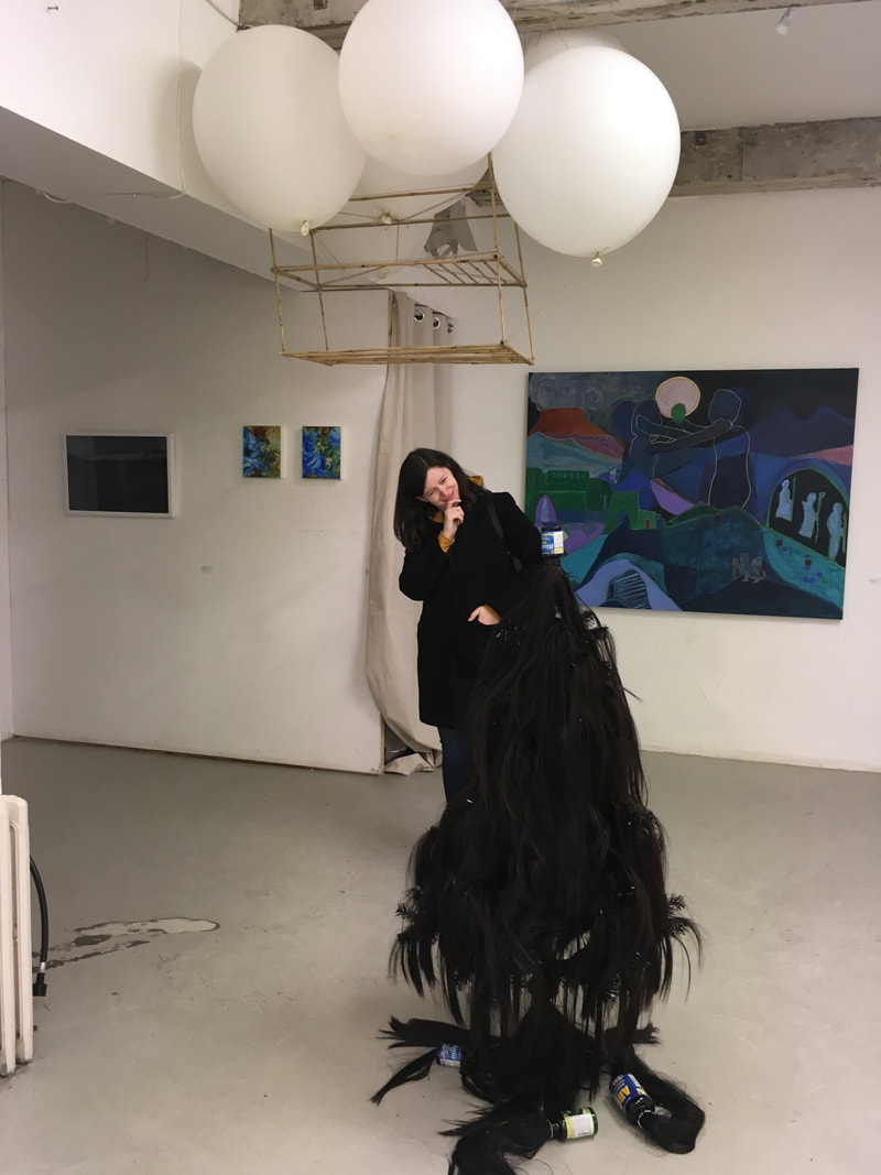
My friend, Heather Scott and I just recently had a look around the Interim show for select postgraduate courses at Central Saint Martins here in London. First year students currently in MA Art & Science, MA Photography and MA Fine Art were showcased in a gallery space in East London, called The Apiary.
Both Heather and I first met when we were first years on the Art and Science course so we admittedly were curious as our exhibition experience our first year was quite appalling so we were hoping that this new space would be an improvement! First impressions on arriving were that the venue was indeed a great deal better than what we had experienced so that was definitely a plus! There was excellent lighting, lots of great wall space, real wooden floors and no unusual railings or dusty corners or odd yellow stripes. But as most student shows go, it didn't wow us unfortunately.....both of us felt that it was way too overcrowded.....there were larger artworks that simply dwarfed smaller pieces and caused us to completely overlook some really nice smaller artwork. More white space would have been a benefit as it was such a jumble. The curating of the exhibition didn't create an easy flow to the work and lets not even get started on the labeling! When I was studying my first degree way back in the 1990's, I remember distinctly that my teachers told us how very important it was to make sure that we knew how to properly label our work in an exhibition setting.....this entailed understanding how to make professional labels that had our name, the title of our work, the date it was created and a relevant description and the price. All vital and basic but something the instructors/curators have forgotten to teach at Central Saint Martins. I'd say that I was most attracted to the MA Fine Art students as a select few were making really interesting work and I will definitely follow them to see what they come up with in their second and final years. One first year in particular was a lady named, Sian Fan who was luckily standing right by her really interesting work when we were trying to understand which label was hers. Sian is an MA Fine Art first year and had such an unusual piece that was suspended from the wooden rafters. I was drawn to her work the moment I walked in the room.....we had a short conversation and were intrigued by her explanation of her work. The fact that it's suspended in the centre of the room and lets light pass through it while also catching and holding light and sound was just fascinating......she explained to us about it being something like a realm in another world.....I'm not doing it justice and I'm eager to talk to her more about her work and hopefully interview her too for my blog. I wish her work had been away from all the other pieces in the room as they overwhelmed it. The image above on the top left is Sian and her work......I found her work very ethereal and I'm intrigued to watch her progress. So keep your eyes out for this artist - Sian Fan! MA Art & Science did not spark any interest in this show sadly......or at least, if there had been labels helping us identify who belonged to what and what it was all about then that could have changed our opinions a bit. I left with a feeling that MA Fine Art are the ones to watch out for.......though only a select few. As for MA Photography which is apparently called something else now.....left us clueless because again......ineffective labels. So well, keep your eyes peeled for Sian Fan (click on her name to reach her website) as she's really creating something exciting! I'd love to tell you to watch for the artist who did the glowing glass thing in the middle photo above but I couldn't find the label! Heather is posing in the photo on the top right because we were utterly confused by the pile of hair and the hanging balloons and sticks.....because again....ineffective labels. We were told on arriving that there would be a tour going through to explain artworks to a visiting group but we didn't join in as we were already half way through the exhibition by that point and on a limited schedule. To check out my friend Heather Scott and her creative process as a graphic designer please follow these links: www.graphicdesignhs.co.uk and www.facebook.com/graphicdesignHS *If you'd like to read more exhibition reviews then please stay tuned every Thursday at 9am UK time for more.
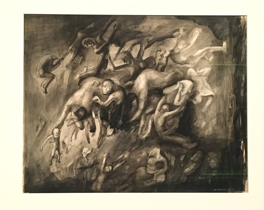
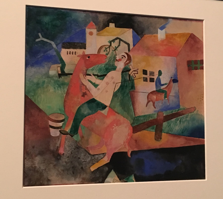
Very recently I went to see the Magic Realism: Art in Weimar Germany exhibition currently at the Tate Modern. First off, its free to get in so that's a bonus right away for those of us trying to save money in an expensive city!
Secondly, it's so worth a look through as the work is exquisite and the content fascinating especially if you're an artist like myself. I'm fascinated by art history and though I have many favourite areas in art history to which I'm most drawn to, (no pun intended!) but I do find very intriguing, the early part of the twentieth century because it feels to me like it's had the biggest impact on my own art practice. I'm interested in patterns you see, not just in my creative process but in history too and so I find this time period of 1919 to 1933 in Germany most interesting indeed as it does have some echoes into our place in history now for good and bad. Get ready though if you go to this exhibition, some of the work is difficult to look at and there is a room in which a sign has been put up to warn people that there are some disturbing images. I didn't stay long in that room and I didn't take pictures in there either as some images did make me cringe. I will say that when I was in art school in the early 1990s, and in the honeymoon stage of being a painter, I found myself living at the fine art museums and literally drinking in the moody paintings of Max Beckmann, Otto Dix, George Grosz and Max Ernst. I'd then return to my studio and whip out my own moody renditions but without a clear understanding of the history behind why the painters that inspired me painted the way they did. It was only after years of reading and researching that I began to grasp what those artists went through and what they were doing in their own creative processes. Even going through this exhibition at the Tate was eye opening in many ways mostly because I'm at the stage in my life as an adult where I can relate to those artists and what they wanted to express in the world they lived in. I've always been what I call, an "Art Activist" and many times have used my artwork and creative ideas to express how I feel about a political situation that has an impact on my world. My ongoing peace project, "11 Million Hands for 11 Million Lives" is an activist project because it's about fighting for equality between all humans on this planet. I've made it clear in my peace project on multiple occasions that I do not support the little orange president in America as well as the inequality and tension he and other world leaders have brought to our existence. So I can relate completely to the artists making art in the Weimar Republic due to the aftermath of war, the political shifting climate, the economic crisis and the unstable social environment which isn't much different than our own time. The artwork in this exhibition is potent and speaks volumes even a hundred years later! I found myself lingering over certain pieces and trying to imagine what the artist was feeling at the time of making it. Their reactions in pen, paint and pencil to their rocky environment in the aftermath of a devastating world war still rings true today. The impacts of social changes and economic hardships still resonate to what I hear in our news now. The repeating of a pattern in history is a concerning weight and I do wonder how our next few decades will pan out. There's a quote on a board in the 2nd room in the exhibition by the artist, Max Beckmann that reads, "What I want to show in my work is the idea which hides itself behind so-called reality. I am seeking for the bridge which leads from the visible to the invisible." I find I can relate yet again to this thought process because I'm often in search of a similar concept in my own work except that it's taken me a lifetime to understand how to go about it and I've yet to arrive at my outcome......Maybe in another forty years! The exhibition itself shows how artists "spoke out" and expressed themselves in times of terrible trauma during and following World War 1 and that's as it should be......artists are the beating hearts of society and will bleed through their work not to make pretty pictures to be be "real". It's something that feels very much the same for today's world. Nowadays our visual input online or in the galleries is pretty pictures or "how to" videos on how to speed draw an eye......it's all meant to entice and be "pretty" and those of us artists who do make artwork that isn't pretty are often put to the side of society because we're doing something risky and different. As an artist who feels for humanity I know what I want is "real" because I'm fed up with our inequality, conflict and injustice in our world now and pretty just doesn't work for me. I think we artists should learn from the patterns of the past and the artists who dared to speak out and we should make art that shocks and wakes up nations because equality is vital for our survival as a human race. So yes, go see the exhibition at the Tate Modern because it'll open your eyes and help you see the patterns in history and how those artists during that time put their hearts and souls into showing real reactions from the world around them. ** Artwork above from left to right: "The Beggar of Prachatice" 1924 by Conrad Felixmüller "Into the Abyss" 1943 by Lea Grundig "The Rider II" 1919 by Heinrich Campendonk Some links you may want to check out: To take part in my art activist peace project, send a photo of your own hands (palms up please) to: www.facebook.com/11millionhands The highlighted words above in the text will take you to orange things, museums and helpful explanation pages to give you further reading. *If you enjoy reading my Thursday postings about exhibition reviews then stay tuned for next Thursday when I review the Interim Show for the postgraduate courses at Central Saint Martins.
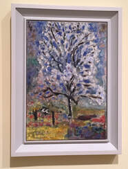
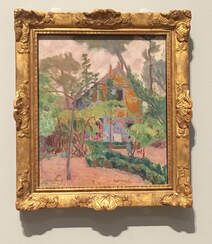
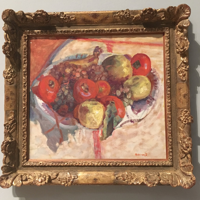
I went to see the current Pierre Bonnard exhibition at the Tate Modern this week and it was not as crowded as I had anticipated! Tickets were as usual quite expensive but I felt it was well worth the money though I'll have to be tight-pocketed for a while. The Tate Modern have given the impression that this exhibition of Bonnard's work is about light and happiness and I must say I felt very different. It is about light and colour of course but I felt that it's also about a man who was rather lonely too and seeking something that was not quite tangible. I found it interesting that he kept returning to his paintings weeks, months and often years later to correct light and colour in them. His life long relationship with Marthe de Meligny who later became his wife seemed so devoted and yet tragic too. I felt that he reflected this in his paintings of her even though some are of her smiling and of their happy home together. His paintings to me had a rather melancholy feel to them. As a painter myself, I remember studying Bonnard when I was in art school in the 1990's. I was at that time in my career, learning to hone my understanding of colour and light in my own studies of the life model so his work then held great fascination for me. Seeing his work again after all these years, I'm brought back to those discoveries I had during my time studying. I found myself trying to dissect some of his paintings to understand what he was doing. I wish we could have seen what his palette looked like as well as his brushes as that would have told even more of his story as an artist. I love the small collection of photos that were included in the exhibition. They were like secret glimpses and very voyeuristic. As an artist who draws and paints from life, I did find it very interesting to see another perspective into how Bonnard worked from memory. For myself, I'm dependent on drawing or painting or sculpting from a source in front of me. When I draw, paint or sculpt without a reference it is just from my imagination and not realistic to what I've been studying but Bonnard would apparently collect linear information in simple sketches beforehand and then work from these and use his memory when in studio. This method has always baffled and yet intrigued me too. It was interesting seeing a studio practice from a different perspective and hopefully this will give me a jolt in my own practice. Experimentation is always good and Bonnard is very inspiring! The interesting thing for me as a now mid-career artist is that it was when I was young and just starting out that I loved his paintings of the human form and how he captured light so perfectly in the skin. Now I'm drawn to the layering of his paintings of his garden as I feel I can understand more deeply what he was trying to do with colour. His paintings of the human form still hold interest but the gardens are just wow in my eyes! His last painting of the blossoming almond tree outside of his bedroom window was so poignant for me. Blossoms at the end of a life describing light and colour and devotion seems well suited as the perfect ending to an artists life such as Bonnard. Wonderful exhibition and I think I will have to return for a second look before it ends. On returning home, I watched a few documentaries about Bonnard and also found a book I'm going to purchase about him on Amazon. Do go to the exhibit if you haven't already. For artists, young and old, consider collecting a stool and sitting to draw. There were quite a few artists sitting drawing in the exhibition when I was there so next time I've made a note to remember my sketchbook. I'll add one more of Pierre Bonnard's paintings at the end here as I bought a postcard of this one because it's so lovely! Its called, "Lane at Vernonnet" 1912. *As always if you enjoyed this post and would like to see more exhibition reviews please stay tuned to this blog every Thursday at 9am UK time for more. 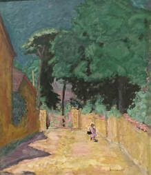 Very recently, I went with a friend to see the latest exhibition at the Heath Robinson Museum in Pinner, North London. The exhibition, entitled, “Heath Robinson’s Home Life” was intensely packed full of his whimsical illustrations and other decorated items like a collection of nursery china plates and cups. What’s really interesting is that I had this strange feeling that I’d known of his work before but from when I was a very little girl and after wandering around the collection, realised that it was from the book, “The Incredible Adventures of Professor Branestawm”, written by Norman Hunter, where I’d first enjoyed Heath Robinson’s wonderful illustrations! The book had been a handed down, well read copy from my older cousins and which helped fuel my own fascinations in contraptions and fun inventions and is probably what inspired me to get into model making!
The illustrations in this exhibition are wonderfully quirky and funny! One of my favourites was the one with the woman who wanted to enjoy the outdoors but lived in a flat so was sitting suspended in a deck chair above the ground…..I think it was a woman! I was paying more attention to the contraptions than the people! Heath Robinson's illustrations spark that childlike imagination we all have of unexpected adventures to distant shores via strange homemade vehicles equipped with all your basic necessities and ready for all possibilities! I’m so glad I’ve learned about this wonderful museum as their permanent collection is really interesting too as is the contents of their shop! It was a fun experience and totally inspired me to get back to my own studio and get creating! In the permanent collection, there are a few of his actual models that move if a dial is turned. They were wonderful and I spent a lot of time watching how each part moved. I definitely look forward to visiting again as there are some upcoming exhibitions in the next month that look very interesting and I’d also like another in-depth look at their permanent collection of Heath Robinson’s work. The gallery also has an activity room which I'm most curious about so I expect I'll be visiting again soon! The current exhibit, “Heath Robinson’s Home Life” will finish this coming Sunday, 24th of February 2019, so do go and visit if you have a chance before it finishes! Next to the gallery, in the house, there's a lovely tea shop too. It's a very nice place for a fun day adventure if you're looking to escape the noise of London! |
AuthorMy name is Franceska McCullough and I'm the owner and artist of Toothpickmoon. Here I will share my studio practice in all it's forms. *Disclosure: The links I'm using on this blog will only ever relate to the products I myself use in my own practice.

Categories
All
Archives
April 2020
|